I'm loving the style, it's been quite a while since I've seen game art that is exactly how I want it!
Suggestions:
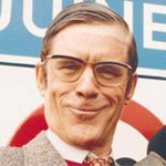
- Please remove "Small talk". I immediatly noticed it and didn't like it. It seems the button actually makes the scene less immersive. It's not fitting for the situation. This scientist is staring at me like he wants me to get out of his face, and we're going to have some small talk? Seems like a waste of precious development time.
- The text elements on screen look way too big for me. I guess this will be resolved with resolution settings?
- I would prefer a grid view or spreadsheet-feel for the research items. Just drawing lines on the clipboard paper would do the trick. That would seem more realistic to me, instead of magically outlining everything perfectly on a blank paper.